A more usable Usablenet
Usablenet is a leading provider of mobile usability solutions to global brands. They provide the strategy, design and technology to create websites and apps tailored to each user's device and context. When you pull up the New Jersey Transit website on your phone, and get a mobile site optimized for train schedules, that's them.
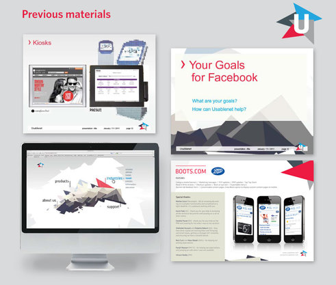
We were recently asked to update their visual brand to provide a fresher, more cohesive system. Specifically, we were asked to elevate their perception from that of a scrappy startup to a world-class leader. While there were nice ideas underlying their previous graphics, the execution often felt discordant and complex - the opposite of smart usability.
Click on each image for a larger view.
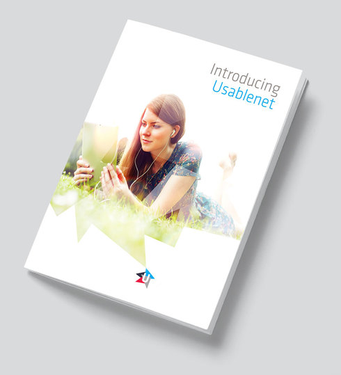
Leveraging the triangles from the existing logo, we transformed them into a multifaceted window for imagery featuring the range of uses for their technology. The logo mark itself - affectionately dubbed the 'spark' - becomes the centerpoint from which the experiences themselves spring.
Additionally, we strove to bring a sense of humanity to the brand, considering usability as "technology with understanding."
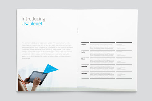
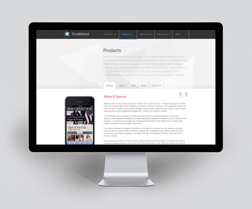
A solid, simple grid underpins all materials, giving a sense of order and clarity to information.
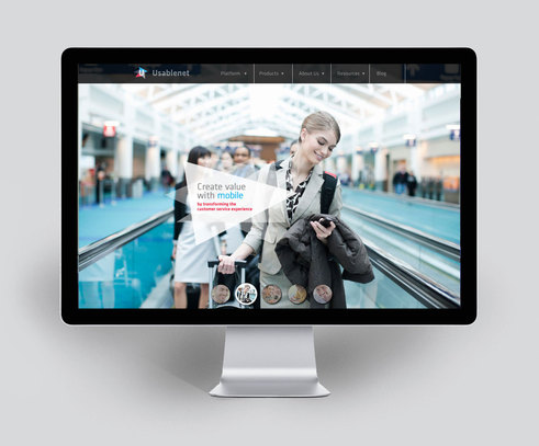
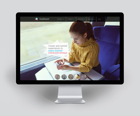
The website opens with a splash of fullscreen images of their technology at work in environments where their solutions excel - travel, retail, etc.
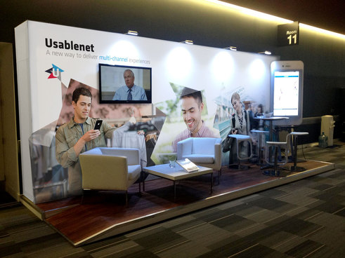
Trade show booth graphics include multi-image collages, underscoring how their tech enables a seamless flow of information across devices and locations.


