Putting the education in education law
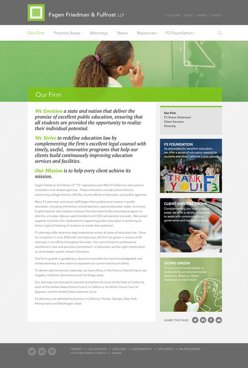
When we built the first website for Fagen Friedman & Fulfrost (affectionately known as F3) back in 2007, they were a young law firm with a handful of attorneys. In the ensuing years, they have grown in size (over 60 attorneys in six offices), services, and reputation - becoming the leading education law firm in California, and counting roughly half of the school districts in California as clients.
We have worked with F3 over the years to create ongoing digital strategy - launching new practice areas, creating promotional videos, and generally growing the site with them. But with their renewed focus on service and technology, we took the opportunity to take a step back and realign the site with their current brand and the needs of their clients.
Mobile and tablet friendly
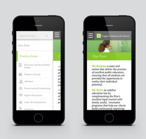
With smartphones and tablets combining to represent 20% of site traffic, we rebuilt the front end from scratch with responsive design principles, to optimize layout for any screen size.
Finding that visitors often come to the site to locate content on a specific topic, we gave the search function prominence, especially on mobile, and included section-specific searches in content-heavy areas of the site, like Resources.
Establishing leadership with educational content
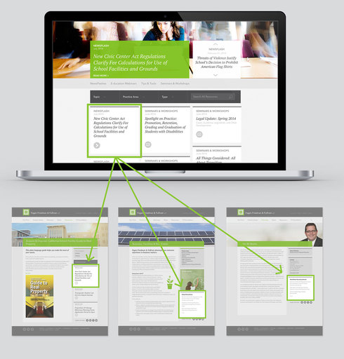
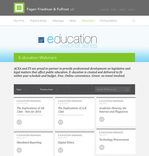
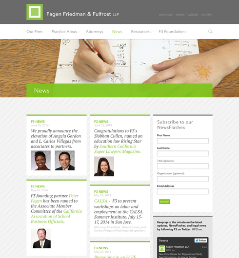
The firm creates a wide variety of educational content for their clients, including NewsFlashes with timely insight on the latest legislation and legal decisions, free webinars on important topics, and downloadable reference tools on hot topics like how to deal with bullying. We created a new dedicated Resources section to house them all - filterable by topic, practice area, and more. And went a step further to create a system to automatically populate them throughout the site alongside other relevant content.
Focus on what clients come to the site for
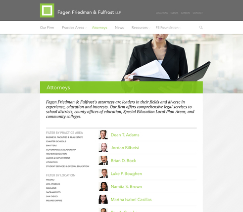
Reviewing usage statistics of the site revealed that the Attorneys page is the second most visited page in the site (and not far behind the home page), so we crafted an easy-to navigate page that allows filtering of attorneys by location and practice area.
Architecting for the next 5 years
The redesign focused on the architecture and visual design, keeping the custom CMS and most existing content intact for a smooth transition; while building opportunities for new site features and sections to come.


