Better Work. Better for All.
For the past year, we have been working with Better Work - a joint partnership between the UN's International Labour Organization and the International Finance Corporation, a member of the World Bank, that works to improve conditions in garment factories - on a strategic rebrand.
The new brand is based on the position that improving working conditions is not just the right thing to do for workers, but actually provides benefits to everyone in the industry - factory owners, supply manufacturers, retail brands and consumers. This has been proven in a new independent report by Tufts University released today that analyzed impact of the programme over the past 7 years, providing direct evidence that better working conditions actually improve profitability in the garment industry.
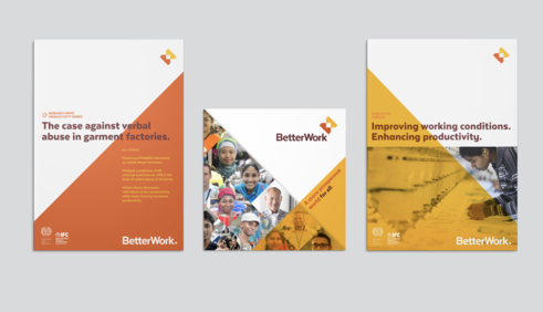
We'll post a full case study with plenty of photos soon, but here are a few preview images from the new system.
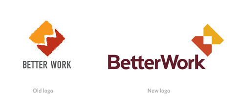
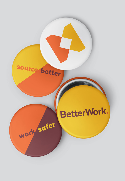
The new logo maintains visual equity from the previous version by utilizing a two-color combination of an abstracted B and W in a diamond. It has been updated with a cleaner, more balanced and confident form that is better integrated with the type and coordinated with the new visual system.
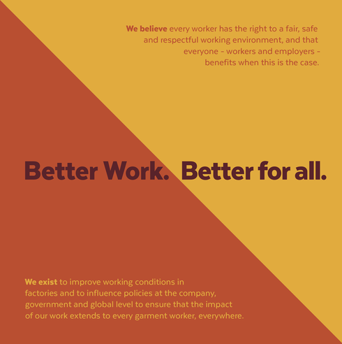
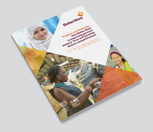
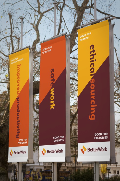
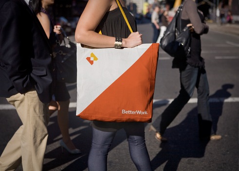
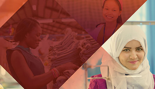
Referencing the logo, primary graphics are based on diamonds and a 45° angle.
Type is often used large, crossing divisions, a visual symbol of how the organization works across boundaries to unite disparate groups for common benefits.
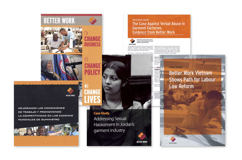
Sampling of old materials:
Samples of new materials in the new system. The color palette has been widened from just orange to encompass golden yellow, paprika orange, and burgundy.

